React Notification Center API Reference This page contains complete documentation about the React Notification Center package. You can find here the list of all the components, hooks, and props that you can use.
Components Components are the building blocks of the React Notification Center package. They are used to build the UI of the notification center.
NovuProvider The NovuProvider is the root component of the React Notification Center package. It is used to wrap the components code and provide the notifications feed context to all its children.
It’s responsible for establishing the notification center session, managing the web socket connection, and fetching the notifications feed.
Prop Type Description backendUrl string (optional) The custom backend URL, your own deployed instance of the API. The default is https://api.novu.co.app/ . socketUrl string (optional) The custom socket URL, your own deployed instance of the WS app. The default is https://ws.novu.co/ . applicationIdentifier string The app id is taken from the Novu Settings -> API Keys tab. subscriberId string The unique user id from your system. subscriberHash string (optional) The HMAC encrypted subscriberId. Read about hmac encryption stores IStore (optional)The connection object between feed and notification center tab. i18n ITranslationEntry | ITranslationContent (optional)The prop allows to configure the UI language. styles NotificationCenterStyles (optional)The prop allowing to style the notification center. It’s based on the CSSInterpolation object from the @emotion/css package. initialFetchingStrategy IFetchingStrategy (optional)The fetching strategy. By default notifications feed and user preferences are not fetched until the notification center is opened. You might need to tweak this configuration when building a custom UI and if you need to fetch notifications right away. Also it’s possible to change it when some action happens using the useNovuContext hook and setFetchingStrategy prop. children object The ReactNode object type, the “consumer” of the NovuProvider context. onLoad function (optional)The function that is called with an organization object after the notification center session is initialized.
Props interface interface INovuProviderProps { backendUrl ?: string ; socketUrl ?: string ; applicationIdentifier : string ; subscriberId ?: string ; subscriberHash ?: string ; stores ?: IStore []; i18n ?: I18NLanguage | ITranslationEntry ; styles ?: INotificationCenterStyles ; initialFetchingStrategy ?: Partial < IFetchingStrategy >; children : React . ReactNode ; onLoad ?: ( data : { organization : IOrganizationEntity }) => void ; }
Store interface interface IStore { storeId : string ; query ?: IStoreQuery ; } interface IStoreQuery { feedIdentifier ?: string | string []; seen ?: boolean ; read ?: boolean ; limit ?: number ; payload ?: Record < string , unknown >; }
I18NLanguage interface type I18NLanguage = 'en' | 'de' ...; interface ITranslationContent { readonly notifications : string ; readonly markAllAsRead : string ; readonly poweredBy : string ; readonly settings : string ; readonly removeMessage : string ; readonly markAsRead : string ; readonly markAsUnRead : string ; } interface ITranslationEntry { readonly translations : Partial < ITranslationContent >; readonly lang : string ; }
Styles interface interface NotificationCenterStyles { bellButton ?: ObjectWithRoot <{ dot ?: CSSFunctionOrObject ; }>; unseenBadge ?: CSSFunctionOrObject ; popover ?: { arrow ?: CSSFunctionOrObject ; dropdown ?: CSSFunctionOrObject ; }; loader ?: ObjectWithRoot ; layout ?: ObjectWithRoot ; header ?: ObjectWithRoot <{ title ?: CSSFunctionOrObject ; markAsRead ?: CSSFunctionOrObject ; cog ?: CSSFunctionOrObject ; backButton ?: CSSFunctionOrObject ; }>; tabs ?: { tabsList ?: CSSFunctionOrObject ; tab ?: CSSFunctionOrObject ; tabLabel ?: CSSFunctionOrObject ; tabIcon ?: CSSFunctionOrObject ; }; accordion ?: { item ?: CSSFunctionOrObject ; content ?: CSSFunctionOrObject ; control ?: CSSFunctionOrObject ; chevron ?: CSSFunctionOrObject ; }; switch ?: ObjectWithRoot <{ input ?: CSSFunctionOrObject ; track ?: CSSFunctionOrObject ; thumb ?: CSSFunctionOrObject ; }>; footer ?: ObjectWithRoot <{ title ?: CSSFunctionOrObject ; }>; notifications ?: ObjectWithRoot <{ listItem ?: { read ?: CSSFunctionOrObject ; unread ?: CSSFunctionOrObject ; layout ?: CSSFunctionOrObject ; contentLayout ?: CSSFunctionOrObject ; title ?: CSSFunctionOrObject ; timestamp ?: CSSFunctionOrObject ; dotsButton ?: CSSFunctionOrObject ; buttons ?: ObjectWithRoot <{ primary ?: CSSFunctionOrObject ; secondary ?: CSSFunctionOrObject ; }>; }; }>; actionsMenu ?: { arrow ?: CSSFunctionOrObject ; dropdown ?: CSSFunctionOrObject ; item ?: CSSFunctionOrObject ; }; preferences ?: ObjectWithRoot <{ item ?: { title ?: CSSFunctionOrObject ; channels ?: CSSFunctionOrObject ; divider ?: CSSFunctionOrObject ; content ?: { icon ?: CSSFunctionOrObject ; channelLabel ?: CSSFunctionOrObject ; success ?: CSSFunctionOrObject ; }; }; }>; } type CSSFunctionInterpolation = ( args : { theme : INovuTheme ; common : ICommonTheme ; colorScheme : ColorScheme ; }) => CSSInterpolation ; type CSSFunctionOrObject = CSSFunctionInterpolation | CSSInterpolation ; type ObjectWithRoot < T = {}> = T & { root : CSSFunctionOrObject ; };
How to use the Styles Interface?
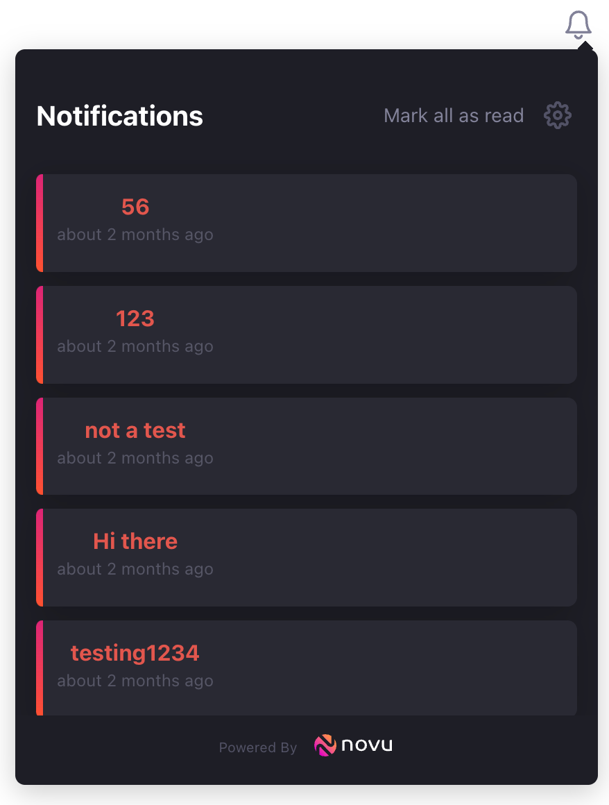
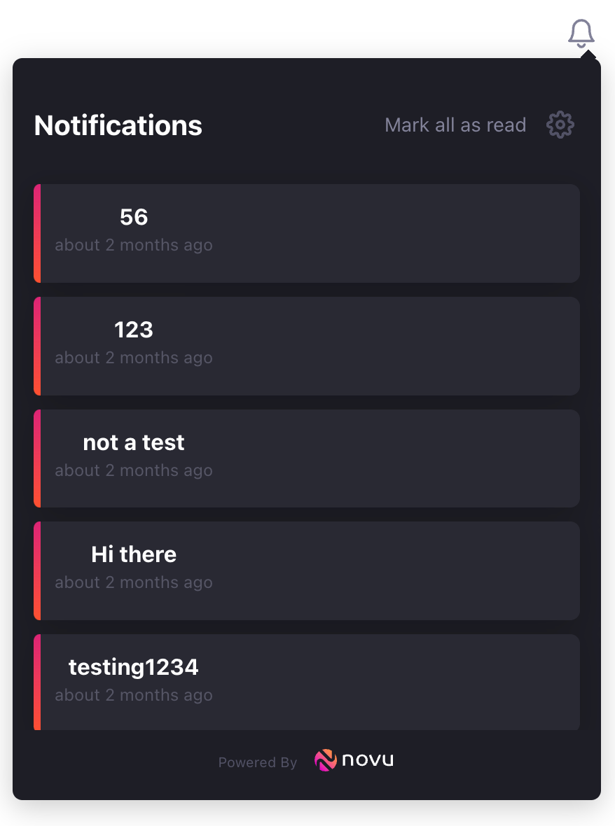
To use the Styles Interface, you need to identify the property you need to modify to achieve your desired look and pass it as an object in the styles prop. As listed in the Styles Interface , the notification center is made up of a number of components which can each be individually customized. You can also check out our docs on customizing styles to see how to define styles for various components that make up the notification center. Let’s take an example to see this in action: By default, this is how the notification center looks: Say, you wanted the text color to match the accent color. You just need to go over to the docs on customizing styles and find out which property needs to be modified. In our case, we need to change the color property as evident here: Now, that we know which property needs to change, all we need to do is pass an object to the styles prop while maintaining the nesting of object keys: < div className = 'bell' > < NovuProvider subscriberId = { process . env . REACT_APP_SUB_ID } applicationIdentifier = { process . env . REACT_APP_APP_ID } styles = { { notifications: { listItem: { layout: { color: '#E3554D' } } } } } > < PopoverNotificationCenter > { ({ unseenCount }) => < NotificationBell unseenCount = { unseenCount } /> } </ PopoverNotificationCenter > </ NovuProvider > </ div >
This gives us the desired result: Please have a look at our
docs on customizing styles to see how to define styles for various components of the notification center.
Fetching strategy interface interface IFetchingStrategy { fetchUnseenCount : boolean ; fetchOrganization : boolean ; fetchNotifications : boolean ; fetchUserPreferences : boolean ; }
PopoverNotificationCenter The floating popover component that appears when clicking on the NotificationBell button. It renders the NotificationCenter component inside its content.
Prop Type Description position string (optional) Position of the popover relative to the bell icon. It is based on the Mantine Popover . The default is set to bottom-end. offset number (optional) Gap between the Bell icon and Popover in px. colorScheme string The UI light or dark mode. theme INovuTheme (optional)The theme object allowing you to override light and dark colors of the UI components. Deprecated for styling, please use the styles prop on the NovuProvider. tabs ITab (optional)Allows to define separate UI tabs for the notifications feed. The array of connection objects between the feed tab and stores (that you define on the NovuProvider) and feed identifier. listItem ListItem (optional)The render function allowing you to define the custom element for the notification list item. showUserPreferences boolean (optional) The flag that enables to show/hide the user preferences. By default it is enabled. allowedNotificationActions boolean (optional) The flag that enables to show/hide the dots menu for actions performed on a notification. By default it is enabled. onUrlChange function (optional) The function that is called when the notification item has a CTA of type redirect and is clicked. onNotificationClick function (optional) The function that is called when the notification item is clicked. onUnseenCountChanged function (optional) The function that is called when the unseen notifications count changed. children function The render function that allows you to define the custom bell button. It’s called with an argument that has unseenCount prop the number of unseen notifications. header function (optional) The render function that allows you to define the custom header component. footer function (optional) The render function that allows you to define the custom footer component. emptyState JSX.Element (optional) The render function that allows you to define the custom component for the empty notifications list state. onActionClick function (optional) The callback function triggered when the notification button is clicked. actionsResultBlock function (optional) The render function that allows you to define the custom component that will be rendered after the notification button is clicked. onTabClick function (optional) The callback function triggered when the notifications feed tab changes. preferenceFilter function (optional) The callback function triggered when filtering the subscriber preference.
Props interface interface IPopoverNotificationCenterProps { position ?: PopoverProps [ "position" ]; offset ?: number ; colorScheme : ColorScheme ; theme ?: INovuThemePopoverProvider ; tabs ?: ITab []; listItem ?: ListItem ; showUserPreferences ?: boolean ; allowedNotificationActions ?: boolean ; onUrlChange ?: ( url : string ) => void ; onNotificationClick ?: ( notification : IMessage ) => void ; onUnseenCountChanged ?: ( unseenCount : number ) => void ; children : ( props : INotificationBellProps ) => JSX . Element ; header ?: () => JSX . Element ; footer ?: () => JSX . Element ; emptyState ?: JSX . Element ; onActionClick ?: ( templateIdentifier : string , type : ButtonTypeEnum , message : IMessage ) => void ; actionsResultBlock ?: ( templateIdentifier : string , messageAction : IMessageAction ) => JSX . Element ; onTabClick ?: ( tab : ITab ) => void ; preferenceFilter ?: ( userPreference : IUserPreferenceSettings ) => boolean ; }
More information about the IMessage interface, and the theme interface.
The tab interface interface ITab { name : string ; storeId : string ; }
The list item interface type ListItem = ( message : IMessage , onActionButtonClick : ( actionButtonType : ButtonTypeEnum ) => void , onNotificationClick : () => void ) => JSX . Element ;
NotificationCenter The component that renders the notifications feed and allows to update the user preferences.
Prop Type Description colorScheme string The UI light or dark mode. theme INovuTheme (optional)The theme object allowing you to override light and dark colors of the UI components. Deprecated for styling, please use the styles prop on the NovuProvider. tabs ITab (optional)Allows to define separate UI tabs for the notifications feed. The array of connection objects between the feed tab and stores (that you define on the NovuProvider) and feed identifier. listItem ListItem (optional)The render function allowing you to define the custom element for the notification list item. showUserPreferences boolean (optional) The flag that enables to show/hide the user preferences. By default it is enabled. allowedNotificationActions boolean (optional) The flag that enables to show/hide the dots menu for actions performed on a notification. By default it is enabled. onUrlChange function (optional) The function that is called when the notification item has a CTA of type redirect and is clicked. onNotificationClick function (optional) The function that is called when the notification item is clicked. onUnseenCountChanged function (optional) The function that is called when the unseen notifications count changed. header function (optional) The render function that allows you to define the custom header component. footer function (optional) The render function that allows you to define the custom footer component. emptyState JSX.Element (optional) The render function that allows you to define the custom component for the empty notifications list state. onActionClick function (optional) The callback function triggered when the notification button is clicked. actionsResultBlock function (optional) The render function that allows you to define the custom component that will be rendered after the notification button is clicked. onTabClick function (optional) The callback function triggered when the notifications feed tab changes. preferenceFilter function (optional) The callback function triggered when filtering the subscriber preference.
Props interface interface INotificationCenterProps { colorScheme : ColorScheme ; theme ?: INovuThemeProvider ; tabs ?: ITab []; listItem ?: ListItem ; showUserPreferences ?: boolean ; allowedNotificationActions ?: boolean ; onUrlChange ?: ( url : string ) => void ; onNotificationClick ?: ( notification : IMessage ) => void ; onUnseenCountChanged ?: ( unseenCount : number ) => void ; header ?: () => JSX . Element ; footer ?: () => JSX . Element ; emptyState ?: JSX . Element ; onActionClick ?: ( templateIdentifier : string , type : ButtonTypeEnum , message : IMessage ) => void ; actionsResultBlock ?: ( templateIdentifier : string , messageAction : IMessageAction ) => JSX . Element ; onTabClick ?: ( tab : ITab ) => void ; preferenceFilter ?: ( userPreference : IUserPreferenceSettings ) => boolean ; }
NotificationBell The component that renders the notification bell with the unseen notifications count.
Prop Type Description unseenCount number (optional) The number of unseen notifications. unseenBadgeColor string or object (optional) The unseen notifications count badge color. unseenBadgeBackgroundColor string (optional) The background color of the notification unseen count badge. colorScheme string (optional) The UI light or dark mode.
Props interface interface INotificationBellProps { unseenCount ?: number ; unseenBadgeColor ?: string | ISvgStopColor ; unseenBadgeBackgroundColor ?: string ; colorScheme ?: ColorScheme ; } interface ISvgStopColor { stopColor ?: string ; stopColorOffset ?: string ; }
Hooks useNotifications This hook that allows you to get the notifications feed data and unseen notifications count. The notifications are fetched only when the fetchingStrategy.fetchNotifications is set to true interface, check the initialFetchingStrategy prop on the NovuProvider component.
const result = useNotifications ();
useNotifications hook return interfaceinterface INotificationsContext { storeId : string ; storeQuery : IStoreQuery ; stores : IStore []; unseenCount : number ; notifications : IMessage []; hasNextPage : boolean ; isLoading : boolean ; isFetching : boolean ; isFetchingNextPage : boolean ; setStore : ( storeId ?: string ) => void ; fetchNextPage : () => void ; refetch : () => void ; markNotificationAsRead : ( messageId : string ) => void ; markNotificationAsUnRead : ( messageId : string ) => void ; markNotificationAsSeen : ( messageId : string ) => void ; markFetchedNotificationsAsRead : () => void ; markFetchedNotificationsAsSeen : () => void ; markAllNotificationsAsRead : () => void ; markAllNotificationsAsSeen : () => void ; removeMessage : ( messageId : string ) => void ; removeAllMessages : ( feedId ?: string ) => void ; }
Description of the useNotifications hook return interface properties
Prop Type Description storeId string active storeId stores IStore[] array of IStore passed to the NovuProvider . unseenCount number unseen notifications (messages) count. notifications IMessage[] The feed notifications array. hasNextPage boolean flag indicating if the next notifications page to fetch is available. isLoading boolean flag indicating if the initial notifications fetch request is on the fly. isFetching boolean flag indicating if the notifications are fetching including initial fetch. isFetchingNextPage boolean flag indicating if the next notifications page request in on the fly. setStore function function used to change the current notifications IStore fetchNextPage function function that fires the fetch request for the next notifications page. refetch function function used to refetch all the notifications, when multiple page requests were made it will refetch all of them. markNotificationAsRead function function takes the notification (message) messageId as an argument and marks that notification (message) as read. markNotificationAsUnRead function function takes the notification (message) messageId as an argument and marks that notification (message) as unread. markNotificationAsSeen function function takes the notification (message) messageId as an argument and marks that notification (message) as seen. markFetchedNotificationsAsRead function function marks all the fetched notifications as read. markFetchedNotificationsAsSeen function function allowing you to mark all the fetched notifications as seen. markAllNotificationsAsRead function function allowing you to mark all notifications as read. markAllNotificationsAsSeen function function allowing you to mark notifications as seen. removeMessage function function takes the notification (message) messageId as an argument and delete a notification. removeAllMessages function The function allowing you to delete all notifications or a specific feed’s (store’s) notifications at once.
useFetchNotifications useFetchNotifications can fetche the notifications for a particular feed. It’s a thin version of the useNotifications hook and is based on the useInfiniteQuery hook from the react-query library. Notifications can be filtered using payload property. Check all properties of IStoreQuery interface. The notifications are fetched only when the fetchingStrategy.fetchNotifications is set to true interface, check the initialFetchingStrategy prop on the NovuProvider component.const query : IStoreQuery = { limit: 10 , payload: { key: "value" , }, }; const onSuccess = ( data : IPaginatedResponse < IMessage >) => {}; const onError = ( error : Error ) => {}; const { data : notificationsPages , hasNextPage , isLoading , isFetching , isFetchingNextPage , fetchNextPage , refetch , } = useFetchNotifications ({ query }, { onSuccess , onError });
useFetchNotifications hook return argsinterface IUseFetchNotificationsArgs { onSuccess ?: ( data : IPaginatedResponse < IMessage >) => void ; onError ?: ( error : Error ) => void ; // ... many more from the react-query useInfiniteQuery hook }
useFetchNotifications hook return interfaceinterface InfiniteData < TData > { pages : TData []; pageParams : unknown []; } interface IUseUnseenCountResult { data : InfiniteData < IPaginatedResponse < IMessage >>; isLoading : boolean ; isError : boolean ; error ?: Error ; // ... many more from the react-query useInfiniteQuery hook result }
useUnseenCount useUnseenCount returns the total unseen notifications count. Under the hood it uses the socket connection to get the unseen count updates.interface ICountData { count : number ; } const onSuccess = ({ count } : ICountData ) => {}; const onError = ( error : Error ) => {}; const { data , isLoading , isError , error } = useUnseenCount ({ onSuccess , onError , });
useUnseenCount hook args interfaceinterface IUseUnseenCountArgs { onSuccess ?: ( data : ICountData ) => void ; onError ?: ( error : Error ) => void ; // ... many more from the react-query useQuery hook }
useUnseenCount hook return interfaceinterface IUseUnseenCountResult { data ?: ICountData ; isLoading : boolean ; isError : boolean ; error ?: Error ; // ... many more from the react-query useQuery hook result }
useSocket useSocket hooks is used to get the reference to socket object.const { socket } = useSocket ();
useSocket return interfaceinterface ISocket { on : ( eventName : string , callback : ( data : any ) => void ) => void ; off : ( eventName : string ) => void ; }
useSocket supported eventsEvent Description notification_received Triggered when a new notification is received unseen_count_changed Triggered when the count of unseen notifications changes unread_count_changed Triggered when the count of unread notifications changes
useNovuContext useNovuContext hook is used to get the reference to the NovuProvider context.const result = useNovuContext ();
useNovuContext hook return interfaceinterface INovuProviderContext { backendUrl ?: string ; subscriberId ?: string ; applicationIdentifier ?: string ; isSessionInitialized : boolean ; socketUrl ?: string ; subscriberHash : string ; apiService : ApiService ; socket ?: ISocket ; fetchingStrategy : IFetchingStrategy ; setFetchingStrategy : ( strategy : Partial < IFetchingStrategy >) => void ; onLoad : ( data : { organization : IOrganizationEntity }) => void ; }
useFeedUnseenCount useFeedUnseenCount hook fetches the unseen count for a particular feed.interface ICountData { count : number ; } const query : IStoreQuery = { feedIdentifier: "product-updates" , }; const onSuccess = ( data : ICountData ) => {}; const onError = ( error : Error ) => {}; const result = useFeedUnseenCount ({ query }, { onSuccess , onError });
useFeedUnseenCount hook args interfaceinterface IUseFeedUnseenCountArgs { onSuccess ?: ( data : ICountData ) => void ; onError ?: ( error : Error ) => void ; // ... many more from the react-query useQuery hook }
useFeedUnseenCount hook return interfaceinterface IUseFeedUnseenCountResult { data ?: ICountData ; isLoading : boolean ; isError : boolean ; error ?: Error ; // ... many more from the react-query useQuery hook result }
useFetchOrganization useFetchOrganization hok fetches the current organization information.interface IOrganizationEntity { _id : string ; name : string ; members : { _id : string ; _userId ?: string ; user ?: Pick < IUserEntity , "firstName" | "_id" | "lastName" | "email" >; roles : MemberRoleEnum []; invite ?: IMemberInvite ; memberStatus : MemberStatusEnum ; }[]; branding ?: { color : string ; logo : string ; fontColor : string ; fontFamily : string ; contentBackground : string ; direction : "ltr" | "rtl" ; }; } const onSuccess = ( data : IOrganizationEntity ) => {}; const onError = ( error : Error ) => {}; const result = useFetchOrganization ({ onSuccess , onError });
useFetchOrganization hook args interfaceinterface IUseFetchOrganizationArgs { onSuccess ?: ( data : IOrganizationEntity ) => void ; onError ?: ( error : Error ) => void ; // ... many more from the react-query useQuery hook }
useFetchOrganization hook return interfaceinterface IUseFetchOrganizationResult { data ?: IOrganizationEntity ; isLoading : boolean ; isError : boolean ; error ?: Error ; // ... many more from the react-query useQuery hook result }
useFetchUserPreferences useFetchUserPreferences hook fetches the user preferences.const onSuccess = ( data : IUserPreferenceSettings []) => {}; const onError = ( error : Error ) => {}; const result = useFetchUserPreferences ({ onSuccess , onError });
useFetchUserPreferences hook args interfaceinterface IUseFetchUserPreferencesArgs { onSuccess ?: ( data : IUserPreferenceSettings []) => void ; onError ?: ( error : Error ) => void ; // ... many more from the react-query useQuery hook }
useFetchUserPreferences hook return interfaceinterface IUseFetchUserPreferencesResult { data ?: IUserPreferenceSettings []; isLoading : boolean ; isError : boolean ; error ?: Error ; // ... many more from the react-query useQuery hook result }
useUpdateUserPreferences useUpdateUserPreferences hook is used to update the user preferences.interface IPreferenceChannels { email ?: boolean ; sms ?: boolean ; in_app ?: boolean ; chat ?: boolean ; push ?: boolean ; } interface IUserPreferenceSettings { template : { _id : string ; name : string ; critical : boolean }; preference : { enabled : boolean ; channels : IPreferenceChannels }; } const onSuccess = ( data : IUserPreferenceSettings ) => {}; const onError = ( error : Error ) => {}; const { updateUserPreferences , isLoading , isError , error } = useUpdateUserPreferences ({ onSuccess , onError , });
useUpdateUserPreferences hook args interfaceinterface IUserPreferencesArgs { onSuccess ?: ( data : IUserPreferenceSettings ) => void ; onError ?: ( error : Error ) => void ; // ... many more from the react-query useMutation hook }
useUpdateUserPreferences hook return interfaceinterface IUpdateUserPreferencesVariables { templateId : string ; // workflowId of mongodbId type channelType : string ; checked : boolean ; } interface IUserPreferencesResult { updateUserPreferences : ( variables : IUpdateUserPreferencesVariables ) => void ; isLoading : boolean ; isError : boolean ; error ?: Error ; // ... many more from the react-query useMutation hook result }
useUpdateAction useUpdateAction hook can be used to update the notification action button status.const onSuccess = ( data : IMessage ) => {}; const onError = ( error : Error ) => {}; const { updateAction , isLoading , isError , error } = useUpdateAction ({ onSuccess , onError , });
useUpdateAction hook args interfaceinterface IUseUpdateActionArgs { onSuccess ?: ( data : IMessage ) => void ; onError ?: ( error : Error ) => void ; // ... many more from the react-query useMutation hook }
useUpdateAction hook return interfaceinterface IUpdateActionVariables { messageId : string ; actionButtonType : ButtonTypeEnum ; status : MessageActionStatusEnum ; payload ?: Record < string , unknown >; } interface IUpdateActionResult { updateAction : ( variables : IUpdateActionVariables ) => void ; isLoading : boolean ; isError : boolean ; error ?: Error ; // ... many more from the react-query useMutation hook result }
useMarkNotificationsAs useMarkNotificationsAs hook that marks the notifications as read or seen.const onSuccess = ( data : IMessage []) => {}; const onError = ( error : Error ) => {}; const { markNotificationsAs , isLoading , isError , error } = useMarkNotificationsAs ({ onSuccess , onError , });
useMarkNotificationsAs hook args interfaceinterface IUseMarkNotificationsAsArgs { onSuccess ?: ( data : IMessage []) => void ; onError ?: ( error : Error ) => void ; // ... many more from the react-query useMutation hook }
useMarkNotificationsAs hook return interfaceinterface IMarkNotificationsAsVariables { messageId : IMessageId ; seen : boolean ; read : boolean ; } interface IUseMarkNotificationsAsResult { markNotificationsAs : ( args : IMarkNotificationsAsVariables ) => void ; isLoading : boolean ; isError : boolean ; error ?: Error ; // ... many more from the react-query useMutation hook result }
useRemoveNotification useRemoveNotification hook allows you to remove a message. It will delete the message for the subscriber and will refetch the feed.const onSuccess = ( data : IMessage ) => {}; const onError = ( error : Error ) => {}; const { removeNotification , isLoading , isError , error } = useRemoveNotification ( { onSuccess , onError , } );
useRemoveNotification hook args interfaceinterface IUseRemoveNotificationArgs { onSuccess ?: ( data : IMessage ) => void ; onError ?: ( error : Error ) => void ; // ... many more from the react-query useMutation hook }
useRemoveNotification hook return interfaceinterface IRemoveNotificationVariables { messageId : IMessageId ; } interface IUseRemoveNotificationResult { removeNotification : ( args : IRemoveNotificationVariables ) => void ; isLoading : boolean ; isError : boolean ; error ?: Error ; // ... many more from the react-query useMutation hook result }
useRemoveNotifications This hook is available from version 0.23.1
useRemoveNotifications hook allows you to remove multiple messages with a limit of 100 messageIds in single call.const onSuccess = ( data : IMessage ) => {}; const onError = ( error : Error ) => {}; const { removeNotifications , isLoading , isError , error } = useRemoveNotifications ({ onSuccess , onError , });
useRemoveNotifications hook args interfaceinterface IUseRemoveNotificationArgs { onSuccess ?: ( data : IMessage ) => void ; onError ?: ( error : Error ) => void ; // ... many more from the react-query useMutation hook }
useRemoveNotifications hook return interfaceinterface IRemoveNotificationsVariables { messageIds : string []; } interface IUseRemoveNotificationResult { removeNotifications : ( args : IRemoveNotificationsVariables ) => void ; isLoading : boolean ; isError : boolean ; error ?: Error ; // ... many more from the react-query useMutation hook result }
useRemoveAllNotifications useRemoveAllNotifications hook allows you to remove all messages of all feeds. feedId can be used as param to delete only specific feed’s messages.const onSuccess = ( data : IMessage ) => {}; const onError = ( error : Error ) => {}; const { removeAllNotifications , isLoading , isError , error } = useRemoveAllNotifications ({ onSuccess , onError , });
useRemoveAllNotifications hook args interfaceinterface IUseRemoveAllNotificationsArgs { onSuccess ?: ( data : IMessage ) => void ; onError ?: ( error : Error ) => void ; // ... many more from the react-query useMutation hook }
useRemoveAllNotifications hook return interfaceinterface IRemoveAllNotificationsVariables { feedId ?: string ; } interface IUseRemoveAllNotificationsResult { removeAllNotifications : ( args : IRemoveAllNotificationsVariables ) => void ; isLoading : boolean ; isError : boolean ; error ?: Error ; // ... many more from the react-query useMutation hook result }
useTranslations useTranslations hook allows you to get the reference to the translations object.const result = useTranslations ();
useTranslations returns interfaceinterface ITranslations { lang : string ; t : ( key : string ) => string ; dateFnsLocale : () => Locale ; }
useNovuTheme useNovuTheme hook can be used to get the reference to the theme object.const result = useNovuTheme ();
useNovuTheme hook return interfaceinterface INovuThemeProviderContext { theme : INovuTheme ; common : ICommonTheme ; colorScheme : ColorScheme ; }
The theme interface interface INovuTheme { layout ?: IThemeLayout ; header ?: IThemeHeader ; popover ?: IThemePopover ; actionsMenu ?: IThemeActionsMenu ; notificationItem ?: IThemeNotificationListItem ; userPreferences ?: IThemeUserPreferences ; footer ?: IThemeFooter ; loaderColor ?: string ; }
IThemeLayoutProperty Default Value (Light Theme) Default Value - (Dark Theme) background #FFFFFF #1E1E26 boxShadow 0px 5px 15px rgba(122, 133, 153, 0.25) 0px 5px 20px rgba(0, 0, 0, 0.2) wrapper.secondaryFontColor #BEBECC #525266
Property Default Value (Light Theme) Default Value - (Dark Theme) badgeColor linear-gradient(0deg,#FF512F 0%,#DD2476 100%) linear-gradient(0deg,#FF512F 0%,#DD2476 100%) badgeTextColor #FFFFFF #FFFFFF fontColor #828299 #FFFFFF
IThemePopoverProperty Default Value (Light Theme) Default Value - (Dark Theme) arrowColor #FFFFFF #1E1E26
IThemeNotificationListItemProperty Default Value (Light Theme) Default Value - (Dark Theme) seen.fontColor #828299 #FFFFFF seen.background #F5F8FA #23232B seen.timeMarkFontColor #BEBECC #525266 unseen.fontColor #828299 #FFFFFF unseen.background #FFFFFF #292933 unseen.boxShadow 0px 5px 15px rgba(122, 133, 153, 0.25) 0px 5px 20px rgba(0, 0, 0, 0.2) unseen.notificationItemBeforeBrandColor linear-gradient(0deg,#FF512F 0%,#DD2476 100%) linear-gradient(0deg,#FF512F 0%,#DD2476 100%) unseen.timeMarkFontColor #828299 #828299 buttons.primary.backGroundColor linear-gradient(99deg,#DD2476 0% 0%, #FF512F 100% 100%) linear-gradient(99deg,#DD2476 0% 0%, #FF512F 100% 100%) buttons.primary.fontColor #FFFFFF #FFFFFF buttons.primary.removeCircleColor white white buttons.primary.fontFamily inherit inherit buttons.secondary.backGroundColor #F5F8FA #3D3D4D buttons.secondary.fontColor #525266 #FFFFFF buttons.secondary.removeCircleColor #525266 #525266 buttons.secondary.fontFamily inherit inherit
Property Default Value (Light Theme) Default Value - (Dark Theme) dotsButtonColor #A1A1B2 #525266 dropdownColor #FFFFFF #292933 hoverColor #F5F8FA #3D3D4D fontColor #525266 #FFFFFF
IThemeUserPreferencesProperty Default Value (Light Theme) Default Value - (Dark Theme) settingsButtonColor#A1A1B2 #525266 accordion.background#FFFFFF #292933 accordion.fontColor#525266 #FFFFFF accordion.secondaryFontColor#828299 #828299 accordion.boxShadow0px 5px 15px rgba(122, 133, 153, 0.25) 0px 5px 20px rgba(0, 0, 0, 0.2) accordion.arrowColor#828299 #828299 accordion.arrowColor#EDF0F2 #3D3D4D accordionItem.fontColor.active#525266 #FFFFFF accordionItem.fontColor.inactive#BEBECC #828299 accordionItem.icon.active#525266 #FFFFFF accordionItem.icon.inactive#BEBECC #525266 accordionItem.switch.backgroundCheckedlinear-gradient(0deg,#FF512F 0%,#DD2476 100%) linear-gradient(0deg,#FF512F 0%,#DD2476 100%) accordionItem.switch.backgroundUnchecked#BEBECC #3D3D4D footer.logoTextColor#000000 #FFFFFF footer.logoPrefixFontColor#A1A1B2 #525266 loaderColorlinear-gradient(0deg,#FF512F 0%,#DD2476 100%) linear-gradient(0deg,#FF512F 0%,#DD2476 100%)
Property Default Value (Light Theme) Default Value - (Dark Theme) logoTextColor #000000 #FFFFFF logoPrefixFontColor #A1A1B2 #525266
customization properties
Property type Default Value (Light Theme) Default Value - (Dark Theme) colorScheme string light light unseenBadgeColor string or ISvgStopColor - - unseenBadgeBackgroundColor string #FFFFFF #1E1E26
ISvgStopColorProperty Default Value (Light Theme) Default Value - (Dark Theme) stopColor #FF512F #FF512F stopColorOffset #DD2476 #DD2476
Others The notification IMessage model IMessage model has the following properties:Property Type Description _id string A unique Novu message identifier channel ChannelTypeEnum Use to specify the actual channel of this message (in_app will be used here) seen boolean Whether the notification item was read by the user, changed when the user clicks on the notification lastSeenDate ISODate When the user has last seen the notification content string An HTML string of the generated notification content with parsed and replaced variables templateIdentifier string A unique Novu workflow identifier payload Record<string, unknown>The payload object that was passed to the trigger even of the workflow. createdAt ISODate The creation date of the message cta.type ChannelCTATypeEnum The type of the CTA specified in the admin panel cta.data.url string The redirect URL set in the admin panel, can be used to navigate on notification click cta.action.status boolean Indication whether the action occurred cta.action.buttons IMessageButton[] Array of action buttons cta.action.result.payload Record<string, unknown>Payload object that send on updateAction method in useNotifications hook cta.action.result.type ButtonTypeEnum Type of the button subscriber SubscriberProps Subscriber object that contains information about the subscriber
SubscriberProps Property Type Description _id string Auto-generated identifier for the subscriber entity in the database firstName string First name of the subscriber subscriberId string identifier of the subscriber entity in the Novu Web Dashboard
Property Type Description type ButtonTypeEnum Button type enum content string Button inner text
ChannelCTATypeEnum Property Value REDIRECT redirect
ChannelTypeEnum Property Value IN_APP in_app EMAIL email SMS sms CHAT chat PUSH push
Property Value PRIMARY primary SECONDARY secondary
 Say, you wanted the text color to match the accent color. You just need to go over to the docs on customizing styles and find out which property needs to be modified. In our case, we need to change the
 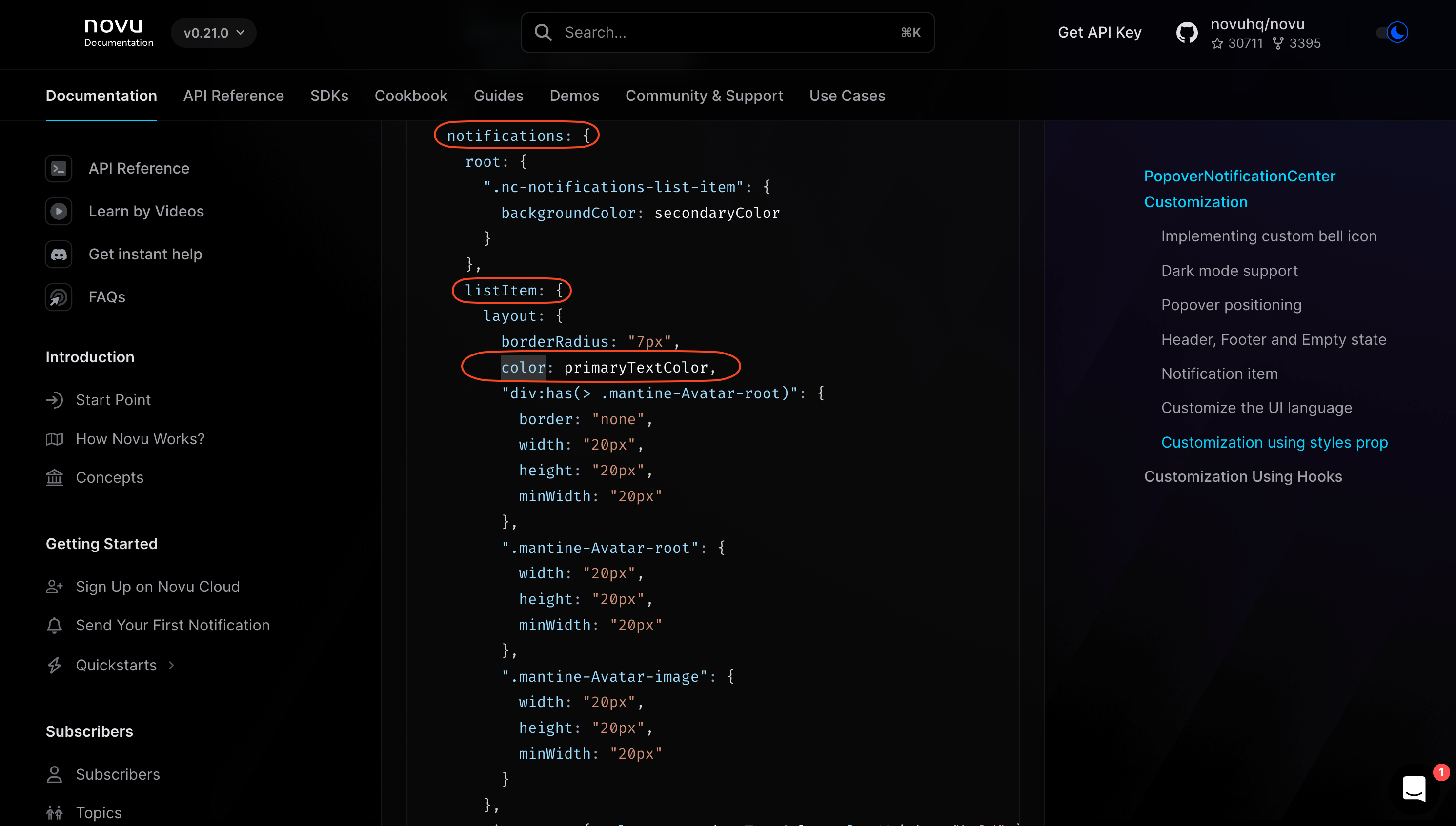 Now, that we know which property needs to change, all we need to do is pass an object to the This gives us the desired result: