The Inbox component is built to allow for multiple layers of styling, which allows the specificity required to style the Inbox to meet the requirements of your use case.Depending on the level of customization you need, you can choose to style the inbox using one of the following approaches:
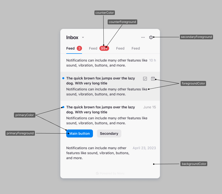
Variables are used to define global styling properties that can be reused throughout the inbox.
You might want to use variables to the styling of multiple components at once, for example, if you want to change the border radius of all the components at once, you can do so by updating the colorPrimary variable, which will modify the CTA buttons, unseen counter and etc…
The elements object allows you to define styles for these components. Each key corresponds to an component, and the value is an object containing style properties or you can also pass your css classes.
Here’s a list of available elements that can be styled using the elements object in your appearance configuration:
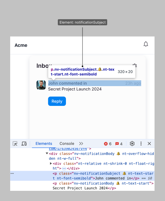
You can inspect the elements you want to customize using the browser’s dev tools, each element has a unique selector that you can use to style starting with nv-.Strip the nv- prefix when and add it to the elements object. For example, to style the nv-notificationPrimaryAction__button element, you can add the following to the elements object:
Any selector that appears before the 🔔 emoji, can be targeted via the
elements property in Appearance prop (stripping the nv- prefix). You can
also use TS autocomplete to find the available elements.
By default, the Inbox notification text for the subject and body is rendered in a normal font weight.
To highlight important words or phrases within your notification messages, you can wrap the desired subject or body text in double asterisks (**).
Here’s an example of how you can do this using the Novu Framework:
Copy
await step.inApp("inbox", async () => { return { subject: "**A new member joined the team!**", body: "**John Doe** joined the team! Say hello and help them feel at home", };});
Please note, that when you are rendering the custom notification component you
will need to parse the text and apply the bold styling accordingly.
Currently we only support bold text. We are working on adding more text formatting options in the future.
You can learn more about the Novu Framework in-app step here.
You can render your own custom notification item component by passing a renderNotification prop to the Inbox or Notifications component, this will allow you to style and render more complex notification items.